

Welcome, dear readers, to another week of comics and commentary at Comics! The Blog! We kick things off, as always, by handing out awards for the Best of the Week - beginning with two Award postings, followed closely by the past week’s Best.
Is it racist to assume a letterer likes Helvetica? I bet it is. I bet this is just like that time my family went to Mexico and spent the entire trip asking their servers if they enjoyed tacos. Dammit, Brandon, get your head out of your ass.

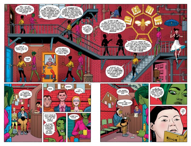
The internet has written a veritable torrent of words about this particular two page spread - and for good reason. It’s a scene that displays the very best the medium has to offer, executed flawlessly by a creative team who is still quite new to working with one another.
I could go on forever about how Javier Pulido constructed this scene (using the stairs as functional panel dividers, giving motion to the conversation through body language) or how much possibility Charles Soule packs into the future of this series in this relatively small space (and solves a “real world” superhero problem like building insurance with something that pulls the entire series away from adult-minded questions and lands it firmly into a world of childlike possibility), but I won’t. Or rather, I won’t beyond that troublingly long sentence. What I would like to do is direct your attention to one of the unsung heroes of this particular spread - letterer Clayton Cowles.
With Pulido throwing down the gauntlet with his layout, a lot of pressure was put upon Cowles to make sure the static image could turn into legible comics. You might not realize it, but one wrong move from Cowles could have wrecked this whole page, turning it from something amazing, into something that the book could have done without, all with a misplaced word balloon.
Beyond drawing the eye along with the action, Cowles did a few other things that helped this sequence sing. I’ve marked three of my particular favourites with purple and orange circles in a blind attempt to match Muntsa Vicente’s vibrant pop-influenced colour palate.
1. The placement of this particular balloon (third in the overall sequence, just in case you can’t find my marker on the page) is what gives the top left quadrant of this panel a three dimensional effect. The first two word balloons draw your eye across the page and moves you alongside Jen and Sharon. The third, placed up against a set of stairs pushes the image far into the background, allowing Jen and Sharon to appear in front of the background. While their presence in front of staircase absolutely contributes to this, the word balloon accents it.
2. This technique continues with the second marked balloong (located just below the big IDEA HIVE INC. logo that is sitting in the background without comment). It’s a balloon that could have been placed a little higher without much consequence, but having it swing low to cover the railing once again allows Jen and Sharon to pop forward.
3. This third balloon is probably my favourite of the bunch. It’s located just to the right of where the red-and-white man is Kitty-Pryding his way through a door, hiding below the stairs. There is a conscious decision made here to avoid touching the stairs, one that helps with the three dimensional illusion the single image is using to tell a sequential story. Placing the balloon on the stair would flatten where the second pair of Jen and Sharon’s are walking, which would flatten the pair way too far back and wreck a bit of the imagery. Also: do you see how my circled “3” runs atop the red-and-white man’s hat? Notice how it stifles the effect of him emerging from the door? Pulido’s work to push him up and out would be for naught had Cowles moved the balloon over too far.
These might all seem like slightly insignificant things, but many pages live or die based off the competency and talent of the person lettering the sequence. Cowles shows that he is one of the best in the business on this page, clearly an equal part of what makes She-Hulk such an amazing book. Cowles is this week’s recipient of our What’s A Kerning Do? Award.
This is the first time we’ve handed a “Best of the Week” award out to a single creator, so Cowles? Use it wisely. We suggest exchanging it for hugs from your local Wal-Mart greeter.
Update: Clayton Cowles swung by Twitter to let us know that Javier Pulido provides balloon placement guides for this book - so we’re amending the award to go out to both of them! Fantastic job, you guys!